B2C
UX/UI Designer
6 Designers & 1 Product Manager
5 weeks
Inclusive design
Figma, Figjam, Google Meet
Challenge
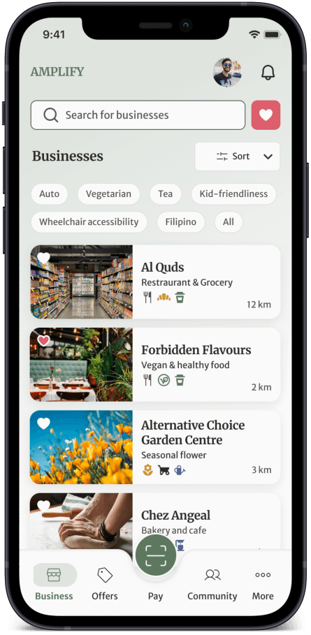
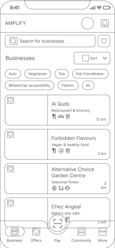
Find a way to support minority-owned local businesses to customers and assist those with language and cultural limitations through a shopping experience that respects differences, enabling customers to choose with dignity.
Solution
Results
Individuals with language and cultural limitations found it easy to navigate through the app.
Let's start from the beginning
What's Amplify?
Owned by The Islamic Family and Social Services Foundation food bank
Assist individuals with language and cultural limitations
Provides services and aid to 5000 individuals in Canada
Main objective of this project
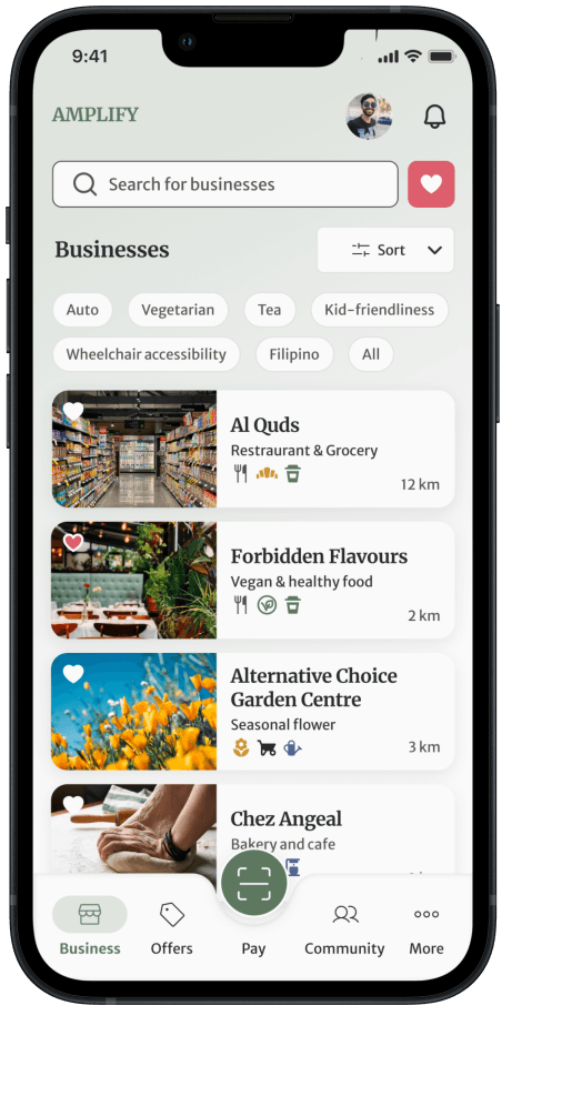
Create an app that will elevate customer loyalty to support minority-owned local businesses and keeping the design in line with accessibility standards.
Discussion of features to create
User stories were provided by the client. This gave us a better understanding of the features that the client wanted us to create.
As a minority individual...
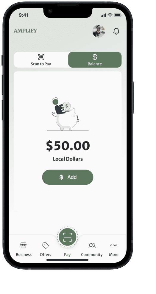
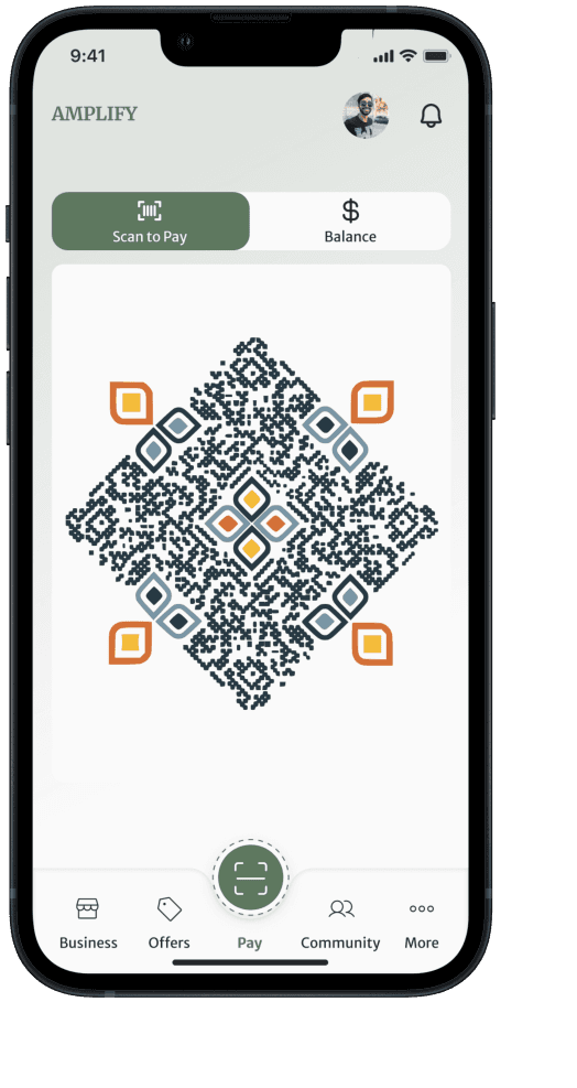
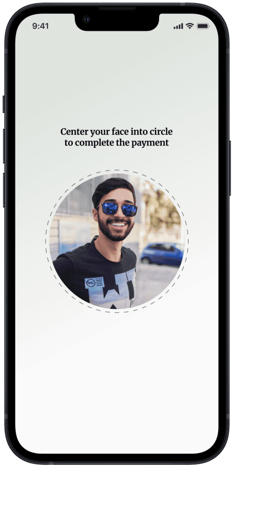
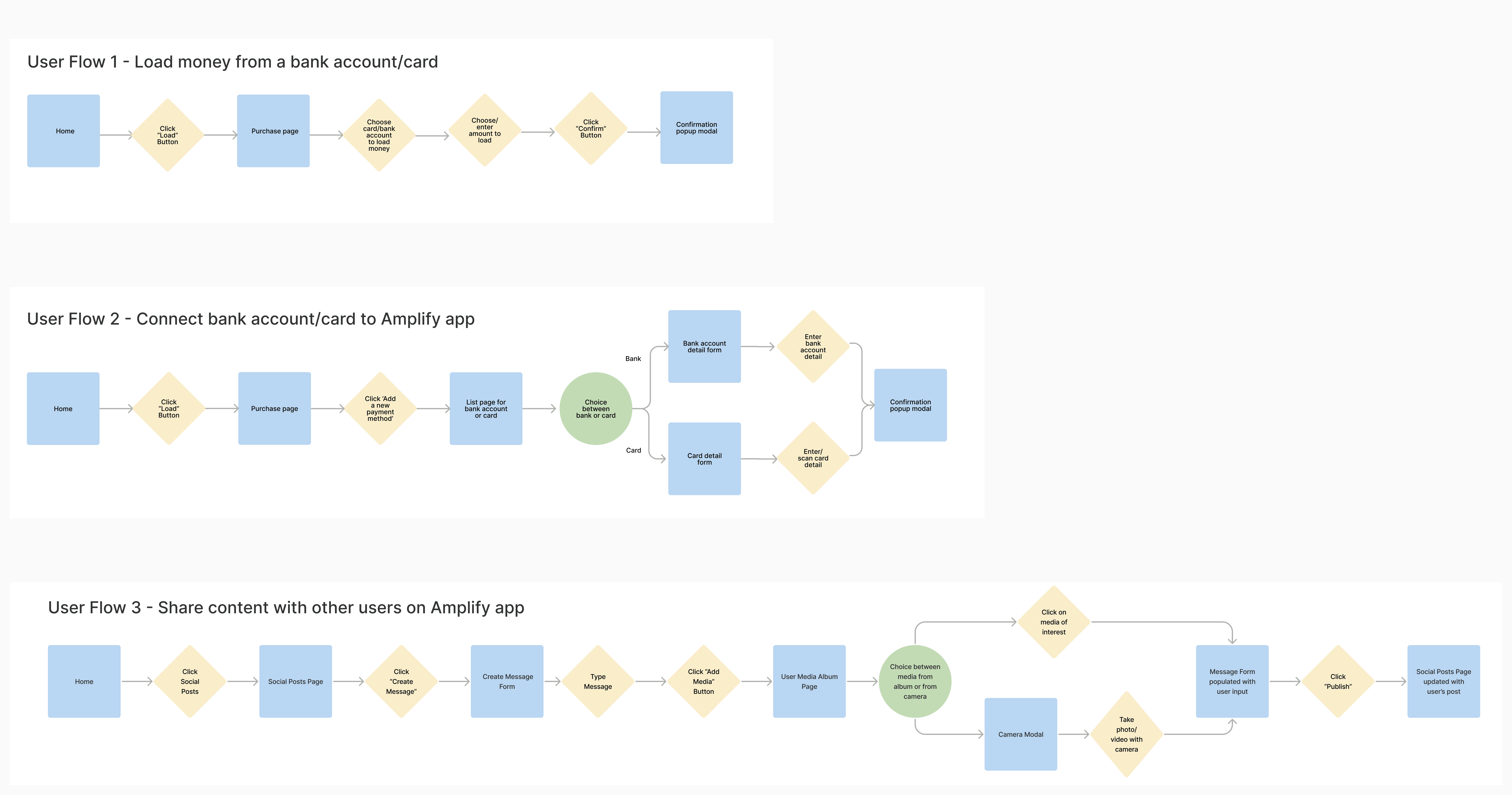
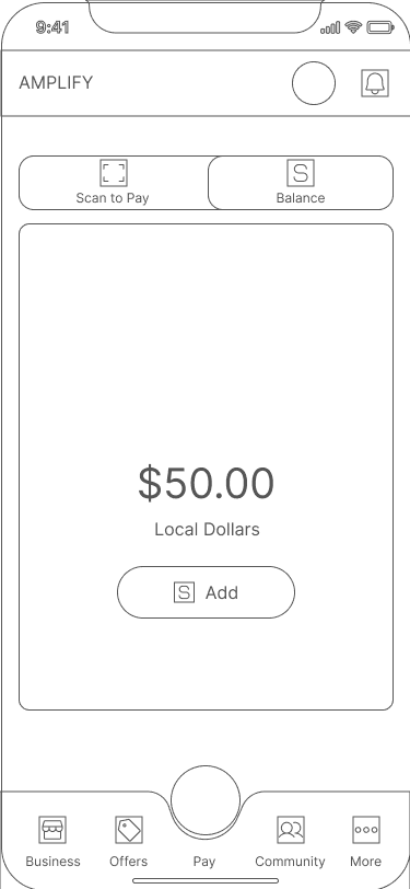
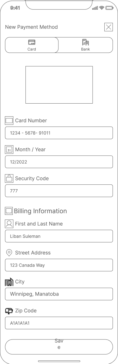
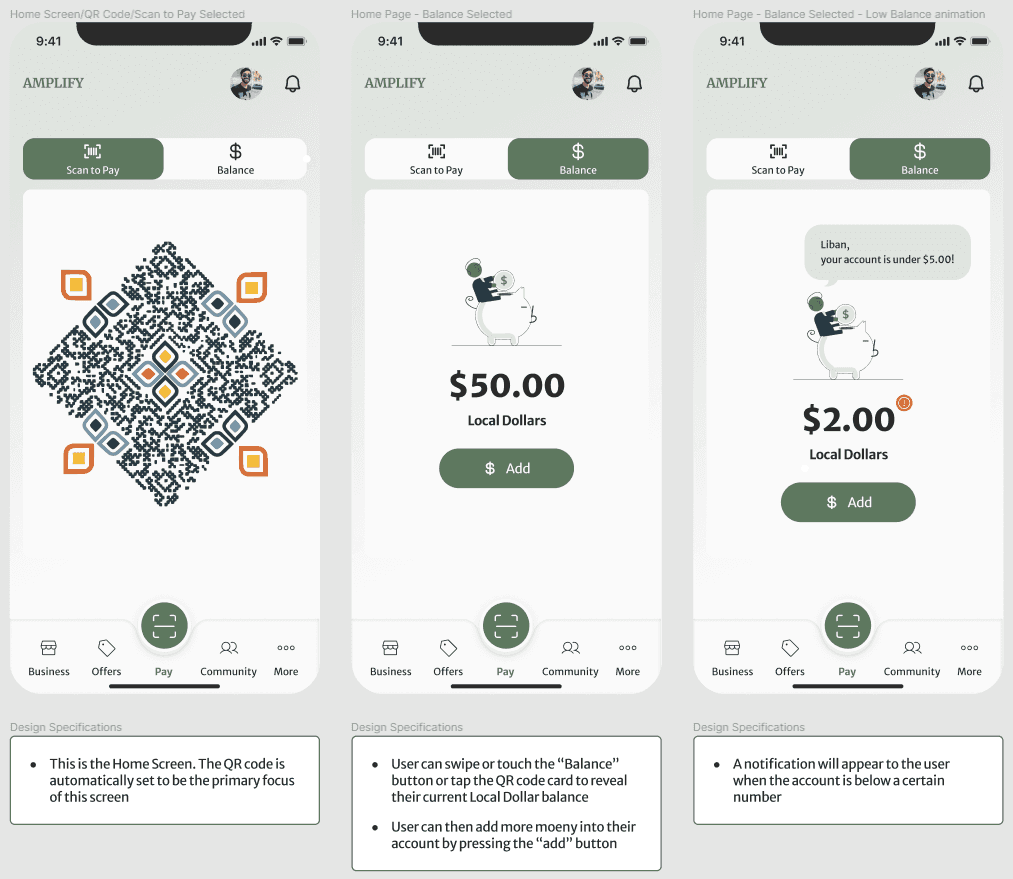
I want to be able to make a purchase using the Amplify app with fewer clicks.
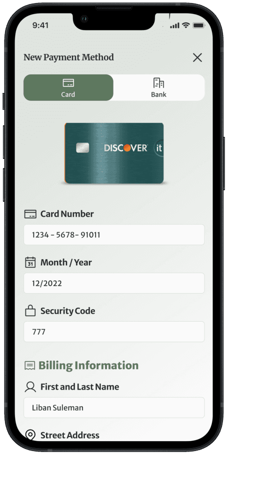
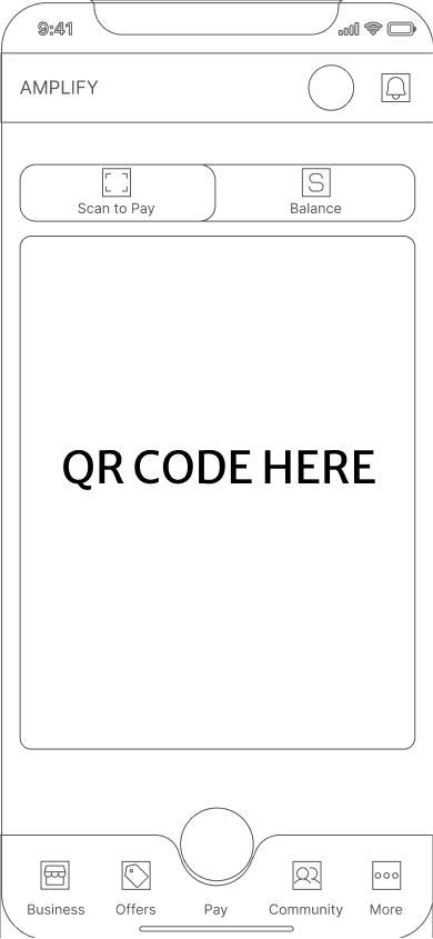
I want to be able to connect my bank account or credit card easily.
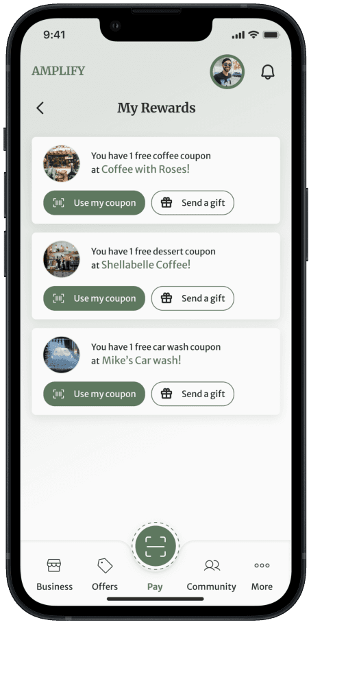
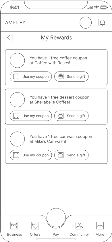
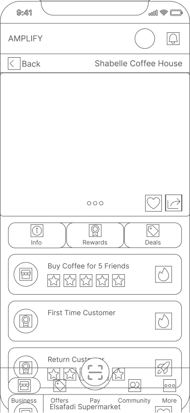
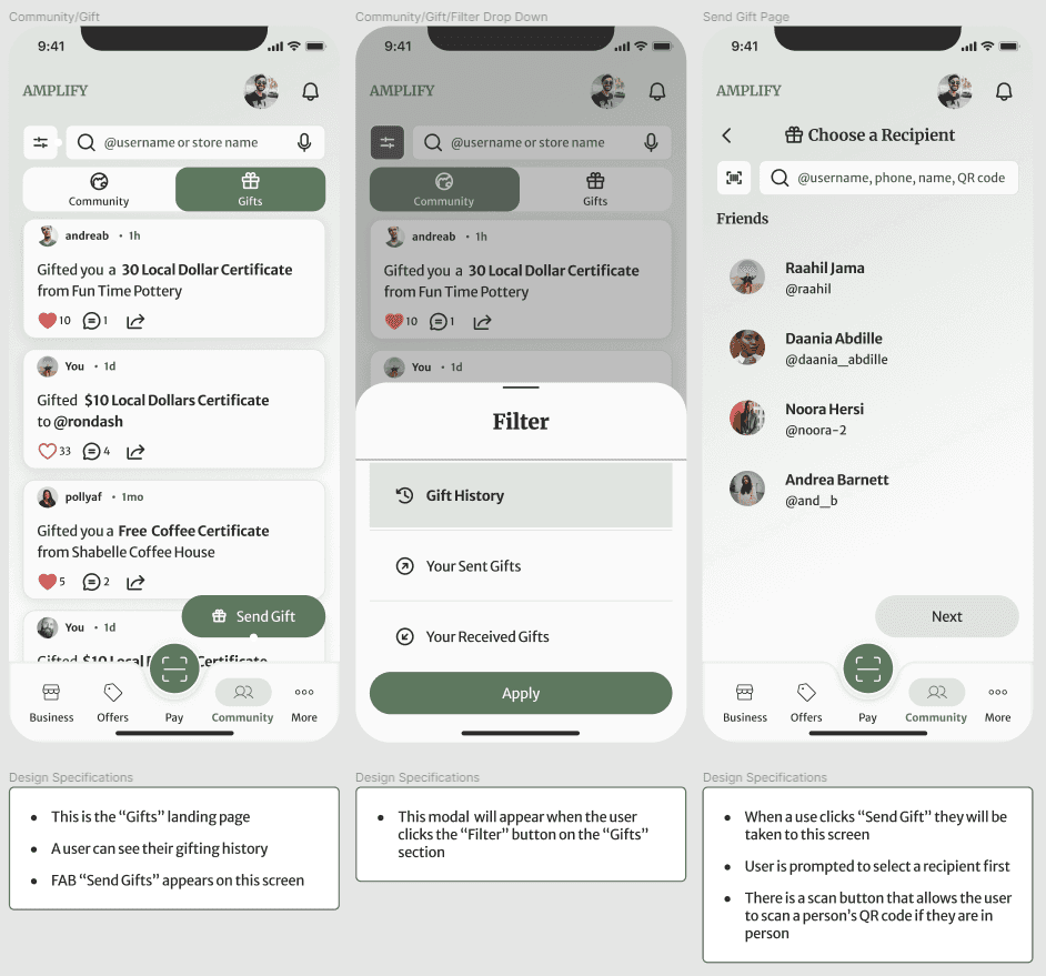
I want to be able to access rewards and be able to share them.
How would an individual with cultural limitations use the app?
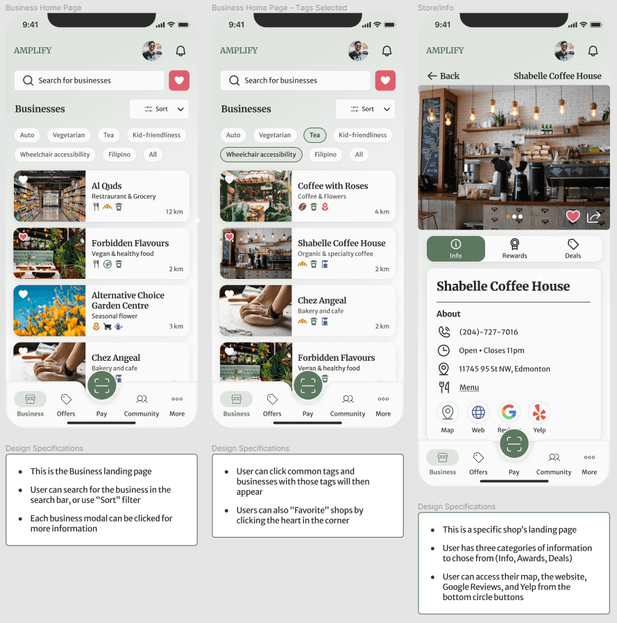
Using the user stories that the client provided, our team created user flows that focused on the features that the client asked for. We wanted the navigation of the app to be user-friendly and only include essential steps depending on the feature.
Let's brainstorm and create a design.
Ideating and Sketching
Using the style guide created, we also created components to ensure consistency for all screens. We were then grouped and assigned to a user flow and created wireframes for them. Our team was not just focused on our own user flow, because we helped each other to come up with solutions. This is where our teamwork really shined.
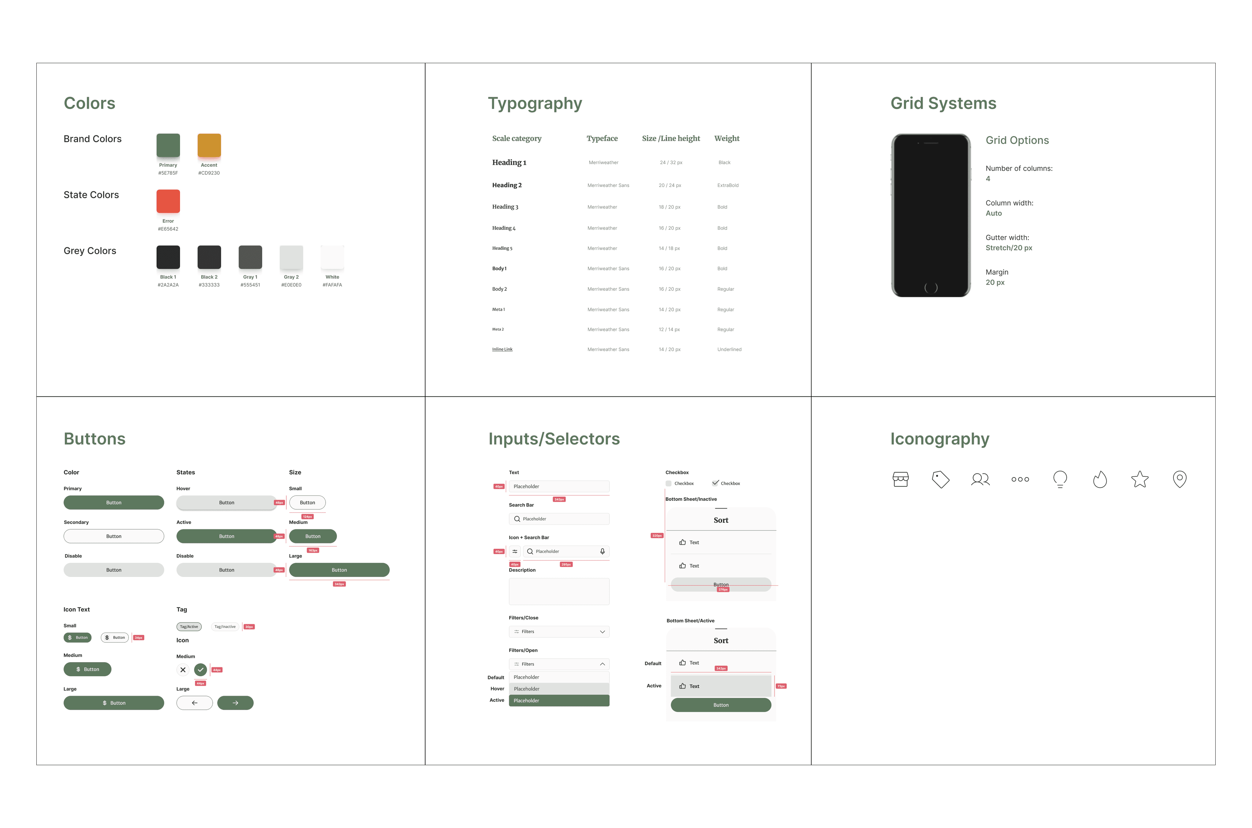
Create a style guide for branding and consistency
I was tasked with creating the style guide we will use for our screens. The client provided us with the brand guidelines they wanted us to use such as font styles and colors. The client gave us the freedom to explore more colors because their current colors do not pass the Web Content Accessibility Test since their color combinations fail the contrast test.
Bring the ideas into designs
We were able to deliver the best design for the client with the added features/screens that they wanted. Our team was able to create 90 screens for our project.
Handing it over to the developers for implementation.
Developer handoff
Our team annotated all screens for each user flow and used arrows on how each screen flowed. We made sure that all the annotations are detailed so that Amplify's developers will understand the design specifications for each screen and how a user will use the app.
Here's my thoughts and learnings
Bonus content!
Here is the video showing our client's reaction after presenting our final product.
View more of my work