Fintech, B2C
UX/UI Designer
5 Designers & 1 Product Manager
5 weeks
User-Centered Design
Figma, Figjam, Google Meet
Challenge
Low to medium income individual struggle to identify investment opportunities that align with their preferences and risk tolerance.
Solution
Design a user-friendly website that provides personalized investment portfolio in real estate, businesses, and gold.
Results
Let's start from the beginning
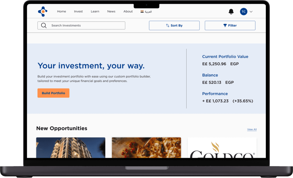
What's Tharwa Crowd?
Connecting investors to partner in investments
Dedicated team to help and manage investments for investors
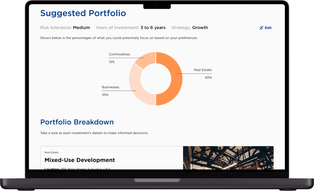
Suggest personalized investments portfolio
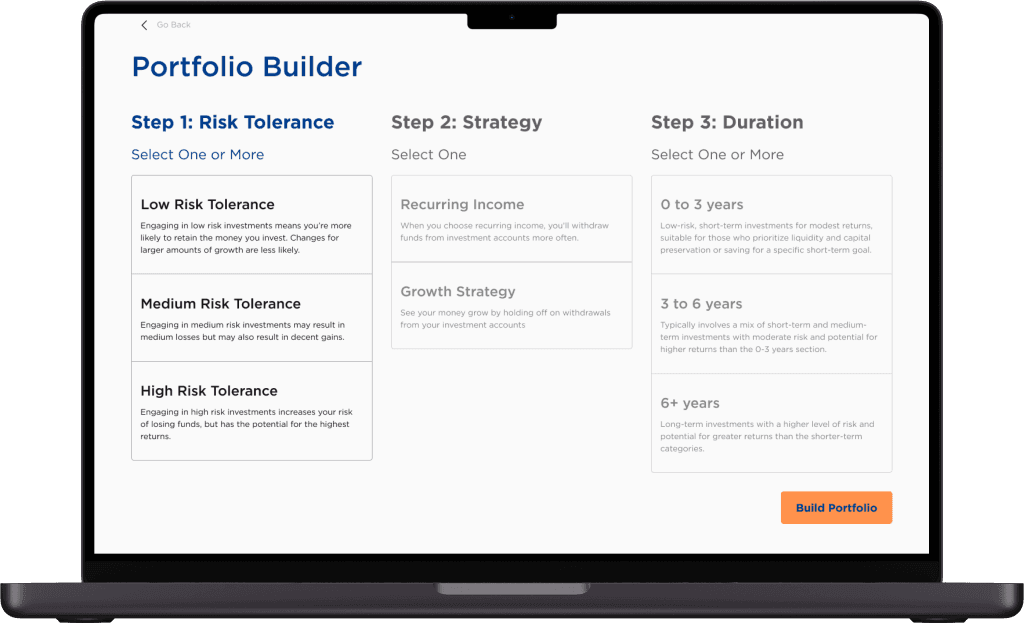
Main objective of this project
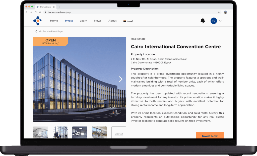
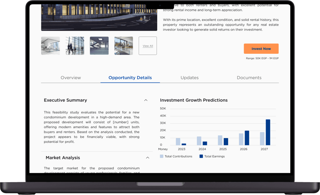
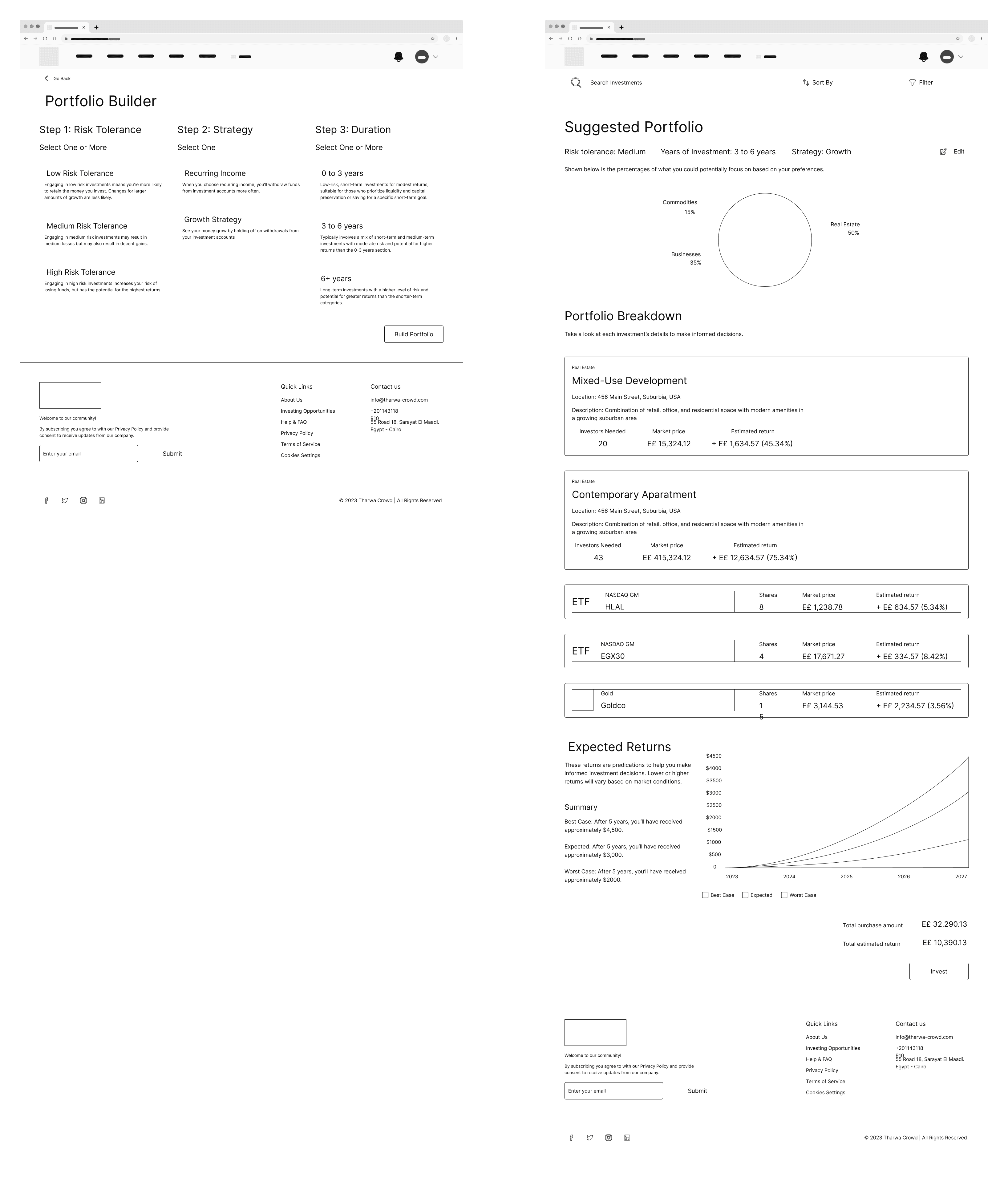
Design a feature that can generate an investment portfolio for an investor based on their preference and be able to learn more about the investments.
Discussion of features to create
The client provided us with user stories that helped us gain a better comprehension of the features they wanted us to develop.
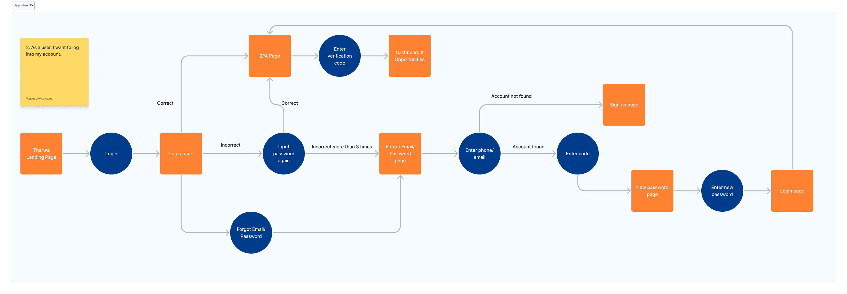
As an investor...
I want to be able to create an account or log in.
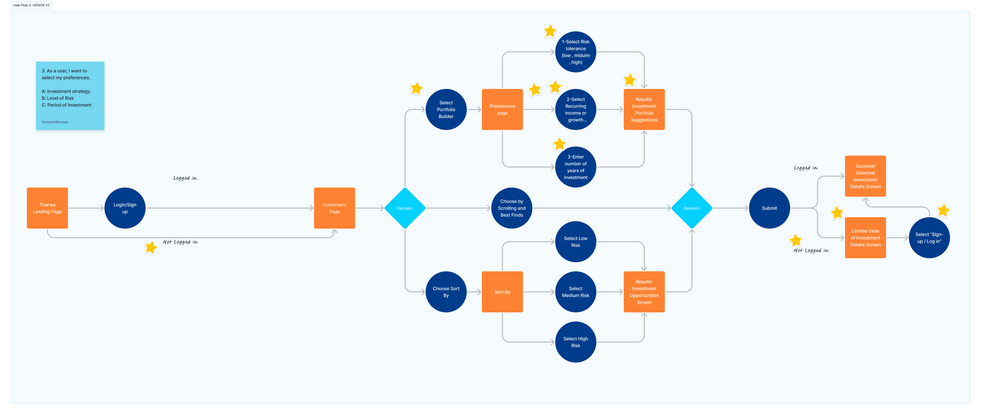
I want to select my preferences such as investment strategy, level of risk, and period of investment.
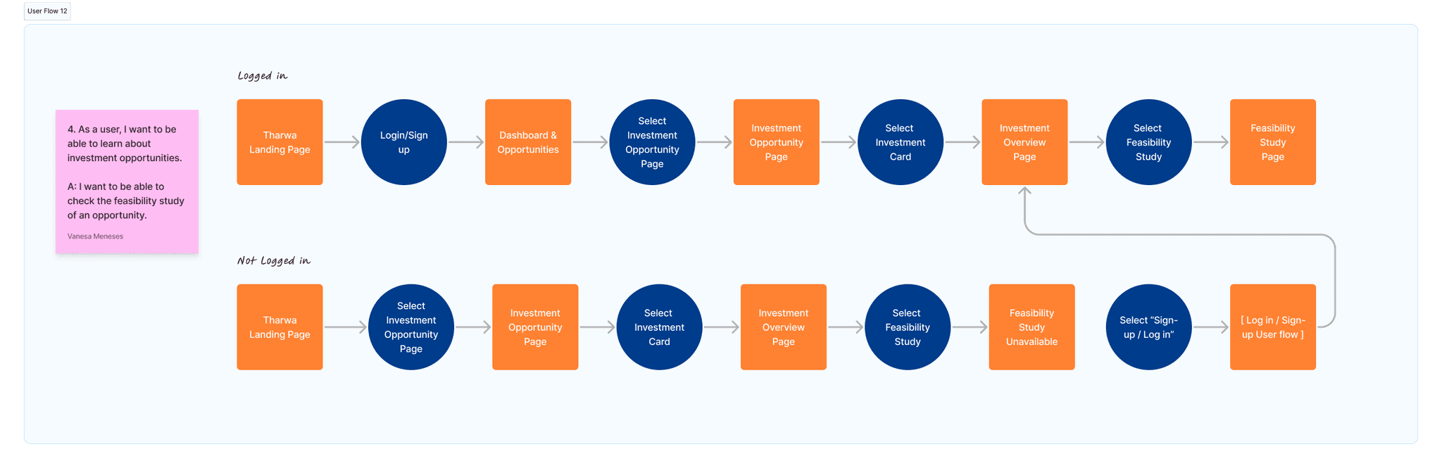
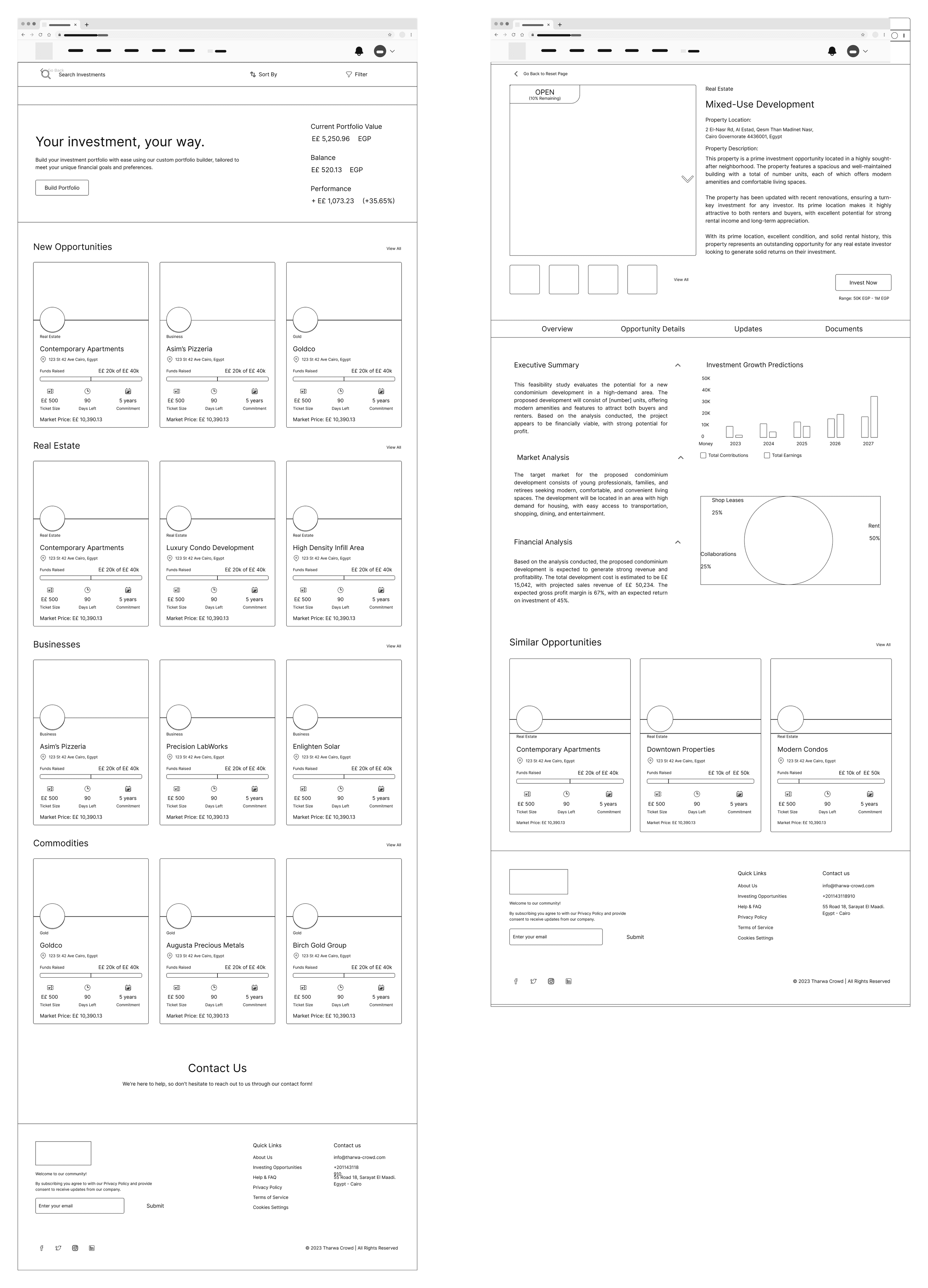
I want to be able to learn about investment opportunities.
How would an investor navigate through the platform?
I was tasked to create user flows for creating an account, and selecting portfolio preferences. To ensure a user-friendly experience, we kept our intended audience in mind and prioritized providing essential information necessary for their investment decisions.
Now that we have an idea, let's ideate and design
Ideating and Sketching
Since the main objective is have a feature that generates an investment portfolio, I suggested to create a Portfolio Builder page, which lets investors pick preferences step by step. Then the team decided to design additional pages such as a login page, landing page, home page, and an investment details page.
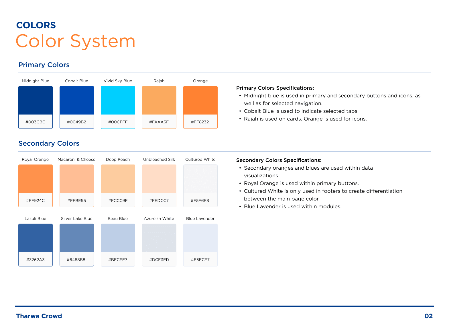
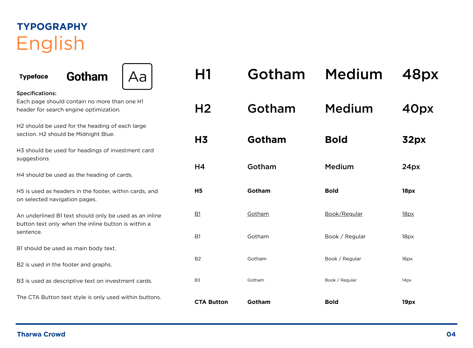
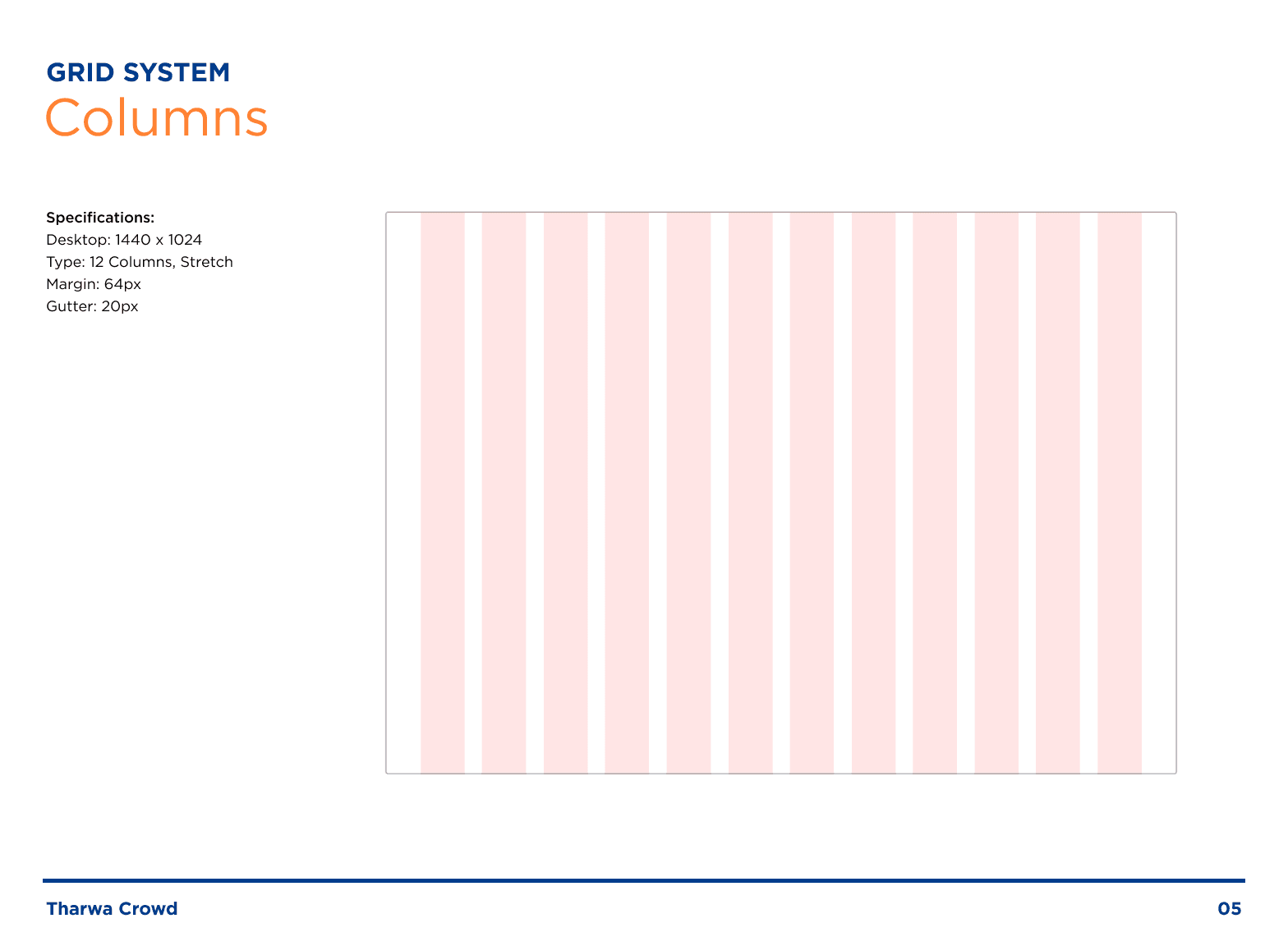
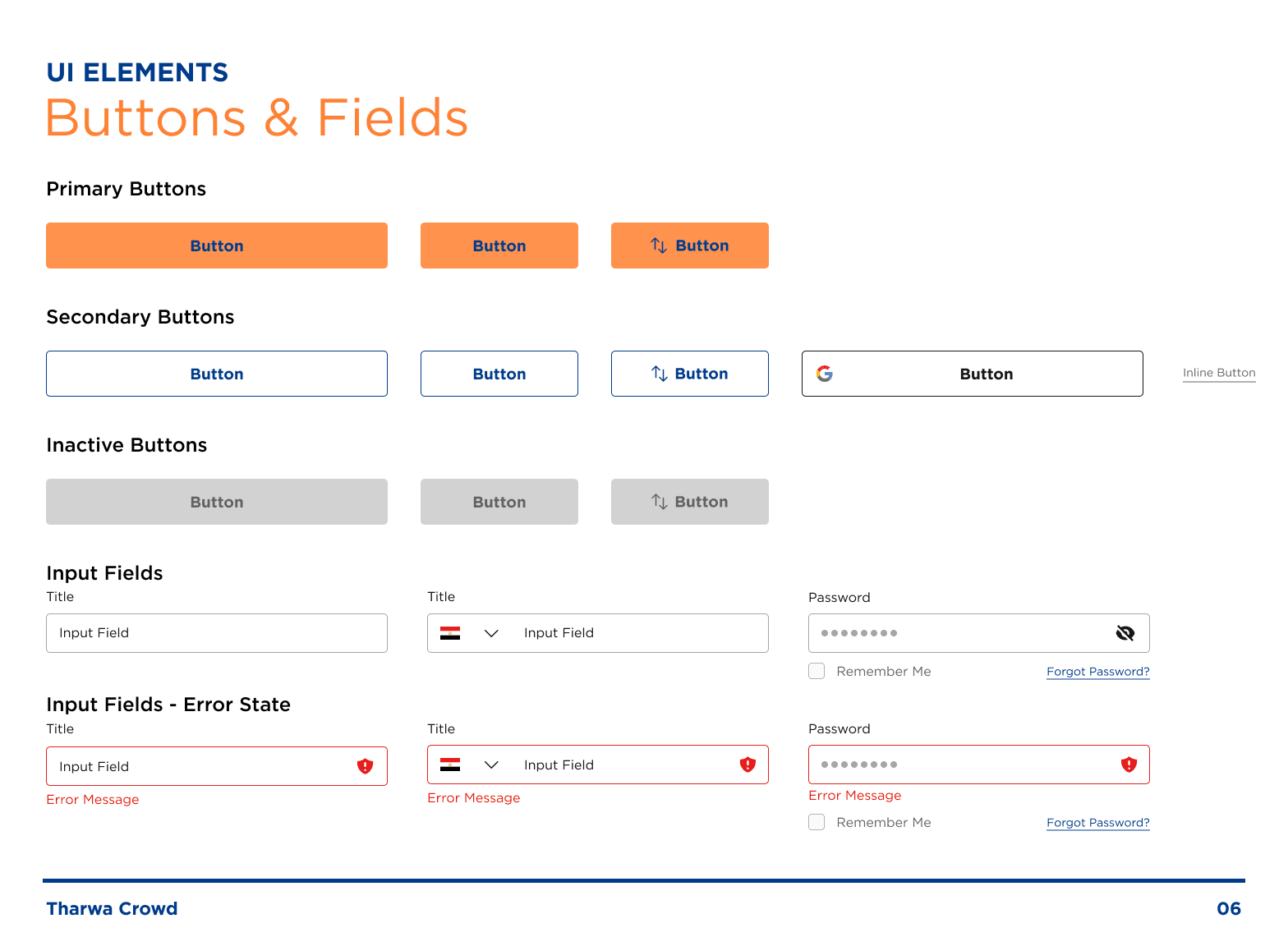
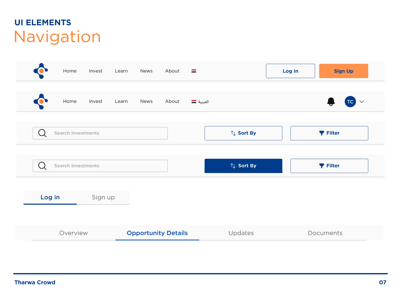
Create a style guide for branding and consistency
Our team established a style guide that adhered to Tharwa Crowd's branding guidelines. We utilized the company's colors, typography, and layout grid to ensure consistency across all screens while ensuring that all colors met accessibility standards.
Putting it all together
I collaborated with the team to finalize user interface screens. I made design decisions that adhered to the style guide and ensured that the color scheme passed the contrast checker. The team also ensured that spacing and margins were consistent and followed best practices. Overall, the Hi-Fi stage enabled us to create a visually appealing and user-friendly design that met the needs and preferences of the target audience.
Giving it to the developers
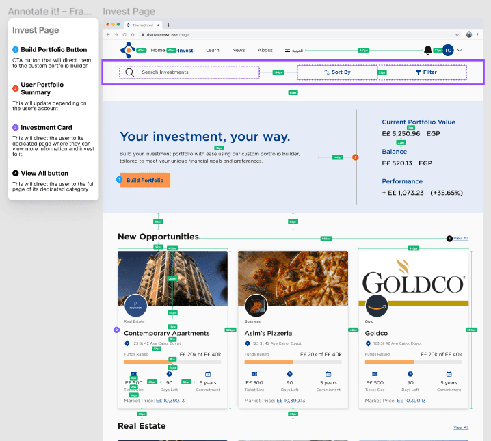
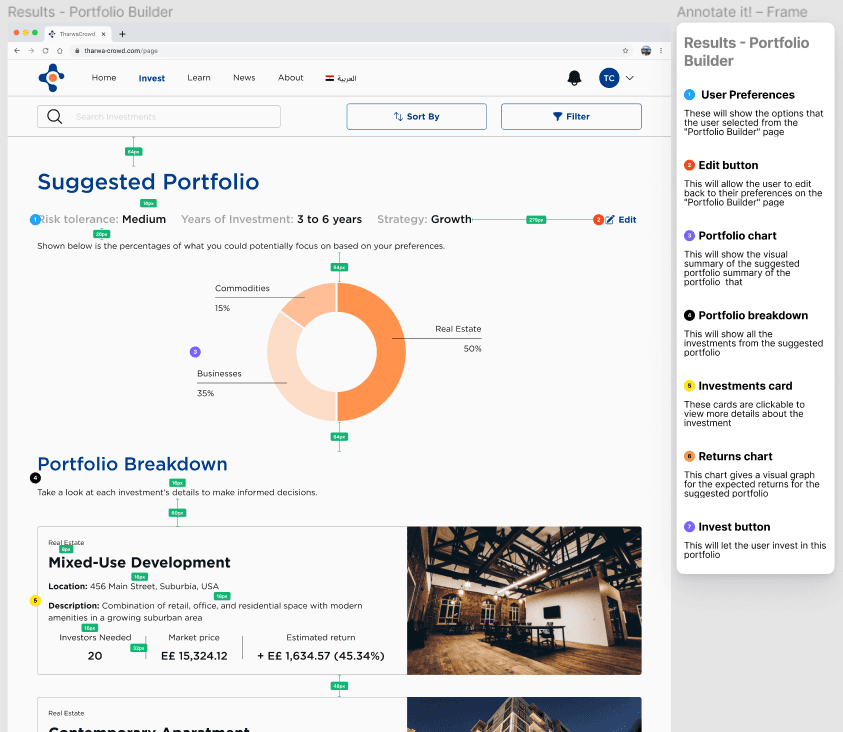
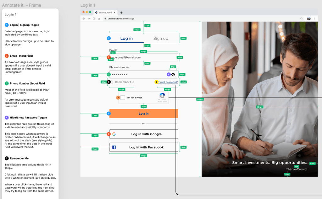
Developer handoff
We inserted measurements and notes for each screen to ensure that developers understand the design specifications and understand the intent of the design. I annotated screens for the Home page, Portfolio builder, and Suggested portfolio.
Here's my thoughts and learnings
View more of my work